How Direction, Texture, and Focus
This image feels full of energy and movement—but why? The answer lies in direction, texture, and where your eye is guided.
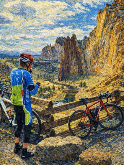
⚡ First Impression
This image feels very different from a calm landscape.
👉 It feels active
👉 It feels textured
👉 It feels alive
Even though nothing is actually moving.
So what’s creating that energy?
🔺 1. Direction (What Creates Energy)
The strongest idea in this image is direction.
Look closely:
- The cliff face rises vertically
- The rock formations point upward
- The sky swirls in curved, moving lines
This creates a mix of:
- Vertical strength (cliffs)
- Curved motion (sky)
👉 Together, they make the image feel dynamic and alive
Why it works:
- Vertical lines feel powerful
- Curved lines feel like motion
🎯 2. Visual Hierarchy (What You Notice First)
Your eye doesn’t look at everything equally.
It likely goes:
- The bright sky with swirling patterns
- The golden cliffs
- The person in the foreground
- Then the bicycle and fence
Why?
- The sky has the most contrast and movement
- The cliffs have strong color and texture
- The person adds a human focal point
👉 This is a strong example of hierarchy guiding attention
🖌️ 3. Texture (Why It Feels So Rich)
One of the most noticeable features:
👉 The texture is everywhere
- Thick, visible brush-like strokes
- Rough surfaces on rocks
- Swirling marks in the sky
This creates:
- Depth
- Energy
- A sense you can almost feel the surface
Why it works:
Texture adds interest without needing more objects.
➡️ 4. Movement (How Your Eye Travels)
This image has a more complex movement than the first one.
Your eye:
- Starts in the sky
- Moves down the cliff edge
- Travels into the valley
- Then returns to the figure and bike
It creates a loop—but a more energetic one.
🎨 5. Color Contrast (Warm vs Cool)
There’s a strong contrast between:
- Cool blues in the sky
- Warm golds and yellows in the land
This does two things:
👉 Separates sky from land clearly
👉 Makes both areas more vibrant
The red bicycle also acts as a small but powerful accent.
⚠️ A Small Weakness (Optional Insight)
If there’s one minor challenge:
👉 There’s a lot happening at once
- Strong texture
- Strong color
- Strong direction
This can feel slightly overwhelming at first.
But in this case:
👉 It fits the energetic style of the image
🧠 What You Can Learn From This
This image shows how art can feel powerful without being complicated.
- Direction → creates energy
- Hierarchy → guides your eye
- Texture → adds richness
- Color → creates contrast and mood
👉 The subject isn’t just the landscape
👉 It’s the experience of the landscape
✏️ Try This Yourself
Next time you look at an image like this:
- Do the lines feel calm or active?
- What do you notice first—and why?
- Does the texture feel smooth or rough?
You’ll start to see how artists create emotion—not just images.
🌱 Closing Thought
Not all art is meant to feel peaceful.
Some art is meant to feel alive, textured, and full of energy.
And once you see how that’s created, you’ll never look at images the same way again.
Posted in art-basics by Geoff (42) Stevens